Rackspace Technology
Transforming UI/UX with a Scalable Design System to Drive Accessibility, Efficiency, and User Satisfaction
As Lead UX Designer IV at Rackspace Technology, I led the creation of a custom design system that elevated UI aesthetics, ensured consistency, strengthened security, and improved accessibility across multiple digital products. This initiative streamlined the design and development lifecycle, boosting user satisfaction and operational efficiency by more than 50% in just six months.
Role:
Lead UX Designer IV
Client:
Rackspace Technology
Timeline:
2021-2023
Location:
USA-Mexico (Remote)
I. Project Overview
- Rackspace Technology is a global leader in cloud computing and managed technology solutions, helping businesses to optimize their digital infrastructure.
- Their services encompass: cloud computing, data management, cybersecurity, and enterprise applications.
- Rackspace also specializes in managed cloud solutions for leading platforms, including Amazon Web Services (AWS), Microsoft Azure, Google Cloud Platform (GCP), OpenStack, and VMware.
- This case study is focused on how I led the creation of a custom design system to enable the efficient, secure and controlled sharing of data. Also elevate UI aesthetics, ensure consistency, and improve accessibility across multiple digital products.
- This initiative streamlined the design and development lifecycle, boosting user satisfaction and operational efficiency by more than 50% in just six months.
II. The Problem Statement
Inconsistent components and outdated design tools at Rackspace Technology needed efficient UI creation and updates because they’re increasing costs, slowing down development times, decreasing overall security and productivity.
III. The Challenges
- Some of the problems and challenges included: Enhancing outdated UI’s across products and inconsistent design components that were slowing down development times and decreasing productivity.
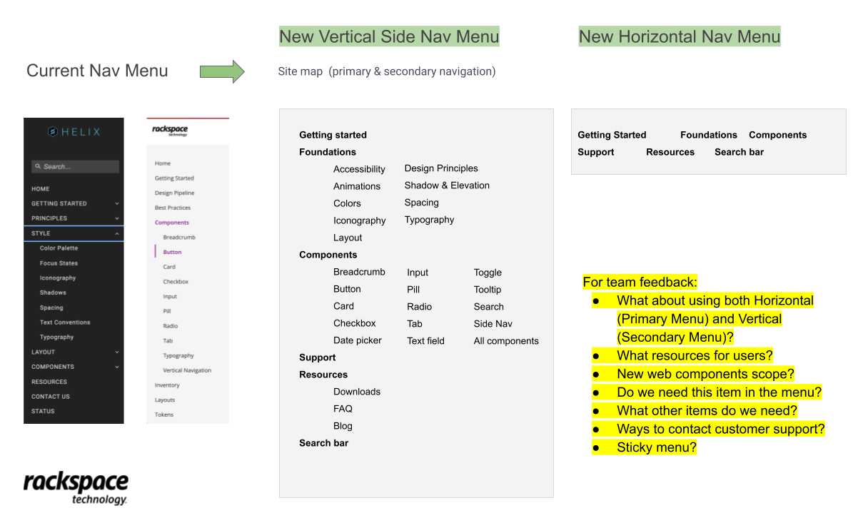
- There were issues with the Navigation that make it hard for users to find essential resources, leading to frustration and inefficiency.
- There documentation was limited and incomplete for the design, development teams.
- The products accessibility didn’t comply industry standards from the WCAG, creating barriers for users with disabilities and limiting overall UX.
📈 The Impact of the new Design System
IV. The Solution
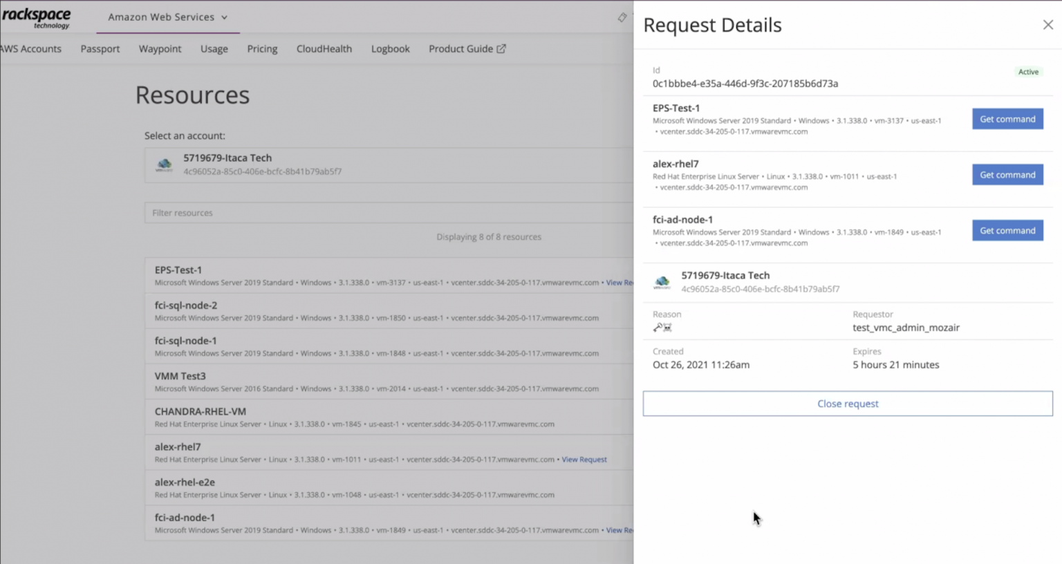
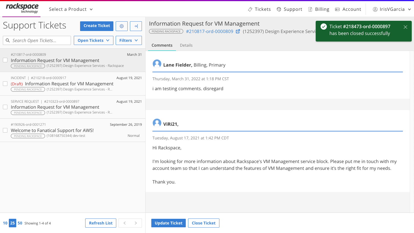
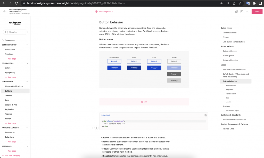
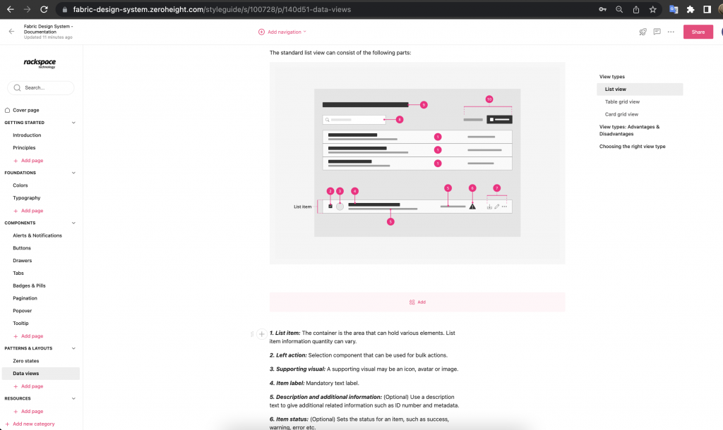
- To address these gaps, I led a team of UX/UI designers and worked closely with a group of stakeholders and developers to incorporate a comprehensive library of components and patterns with defined design guidelines and documentation that I personally wrote and refined with AI Tools.
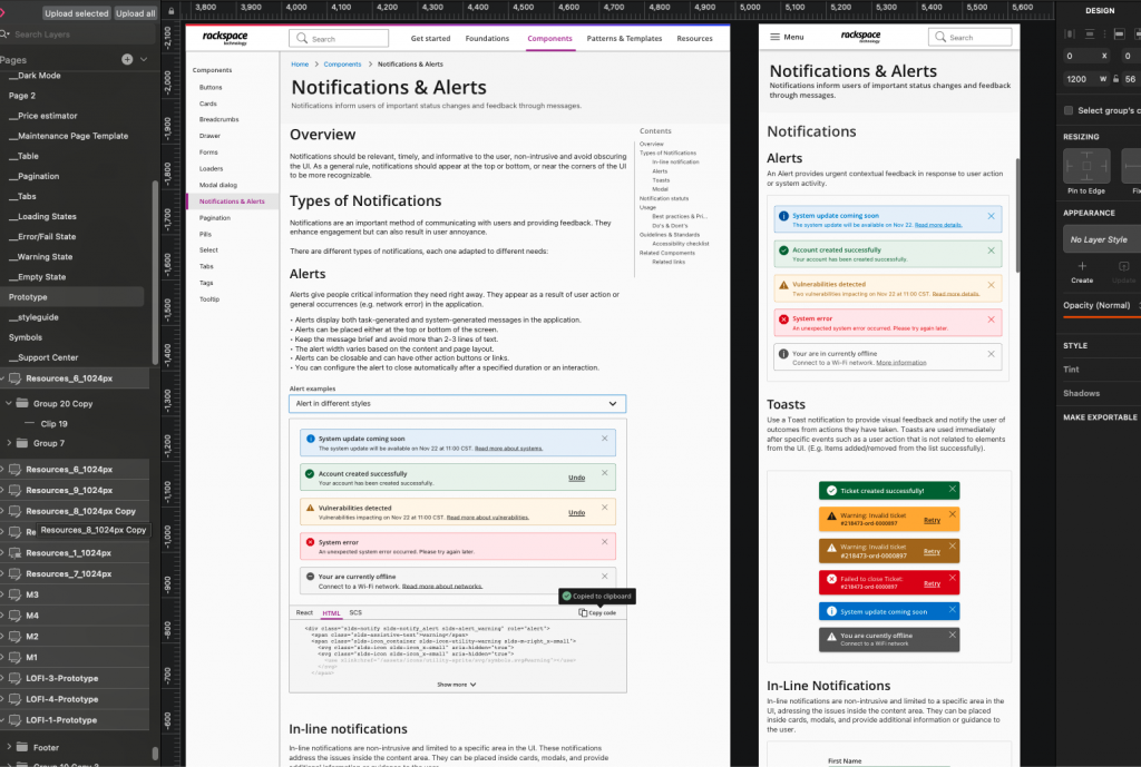
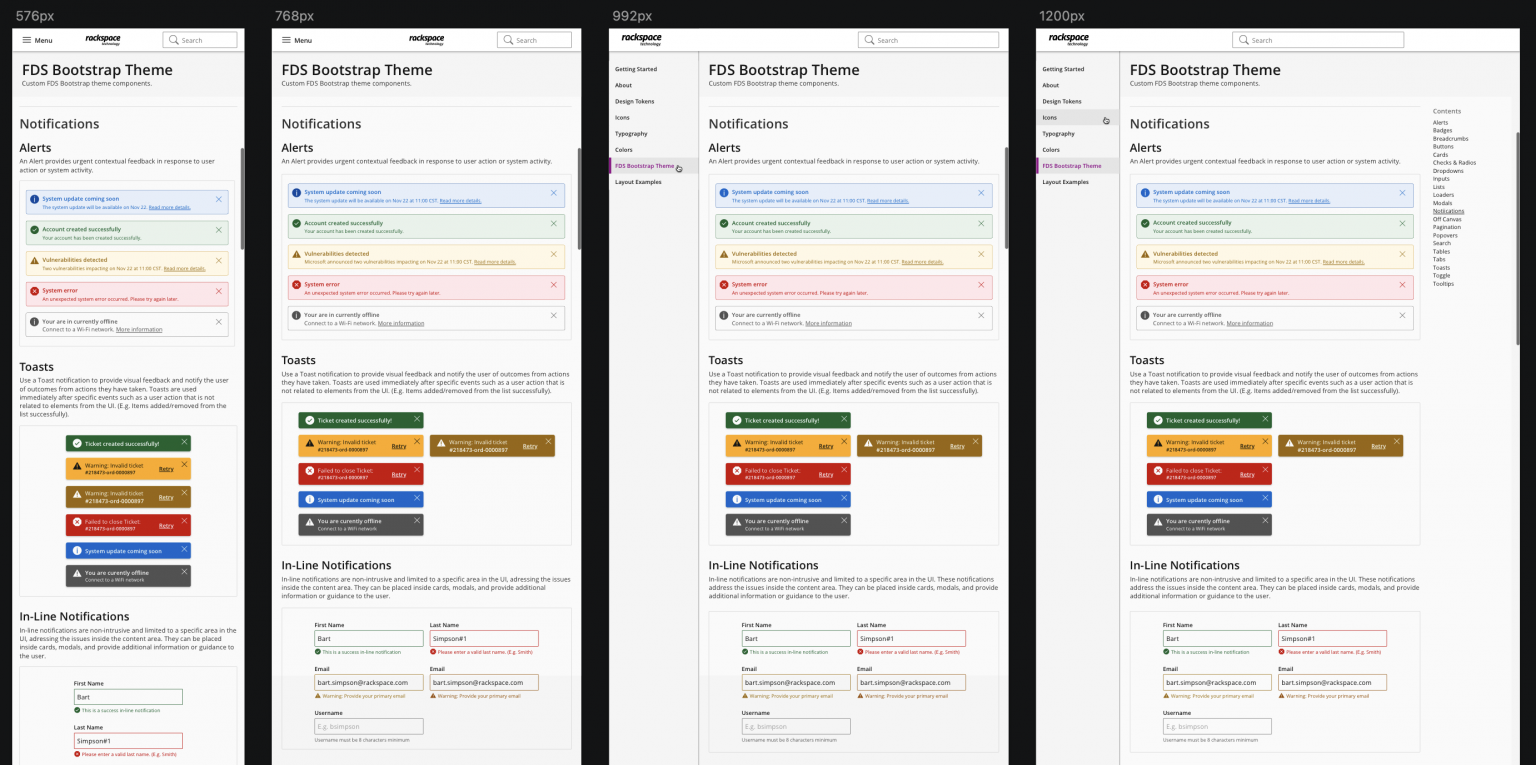
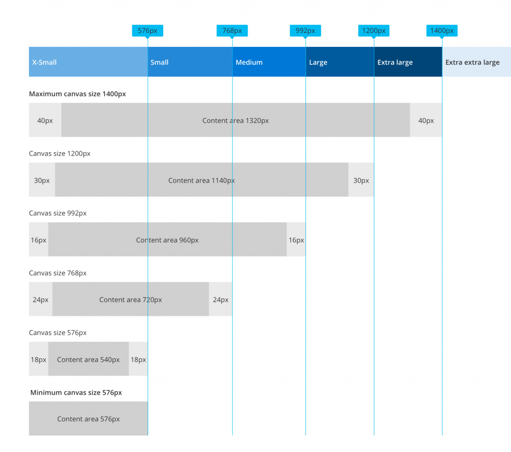
- The solution we developed is an scalable and versatile design system tailored for Rackspace, designed to streamline and standardize the design and development process across various projects. This comprehensive system features a library with more than 25 categorized components, all built using an atomic and customizable design approach with refined documentation.
- By integrating these components into a cohesive framework, the design system not only ensured visual and functional consistency, but also significantly accelerated development cycles and enhanced customization capabilities. The result is a powerful tool that facilitates efficient, high-quality design production while adapting diverse branding requirements, and client needs.
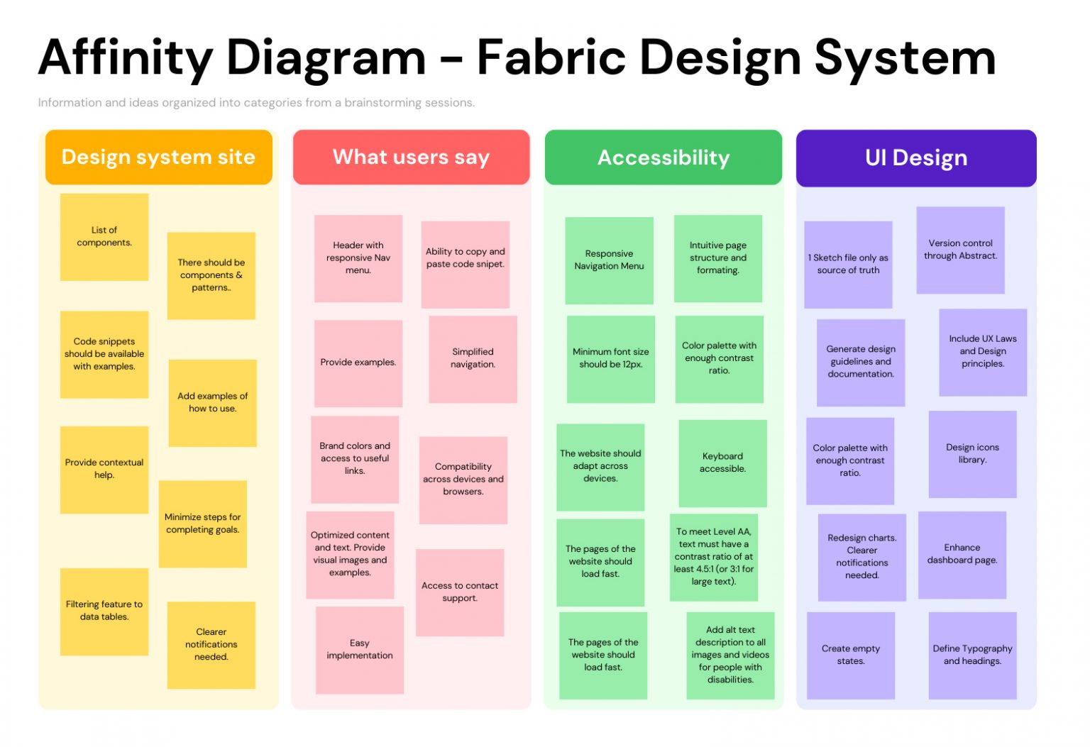
- These solutions are based on data analysis and insights from UX research, and feedback gathered from end-users and stakeholders to ensure the alignment with the business goals and user needs.
- The Fabric design system aimed at enhancing UI aesthetics, consistency, security, and accessibility across multiple digital products by achieving the WCAG compliance and industry standards that helped to extend the products’ usability to a broader audience, allowing us to pass the applied accessibility tests and heuristic evaluations.
The Old Version
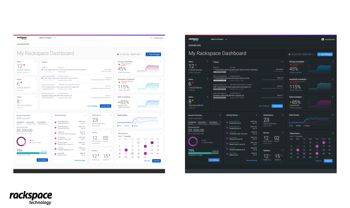
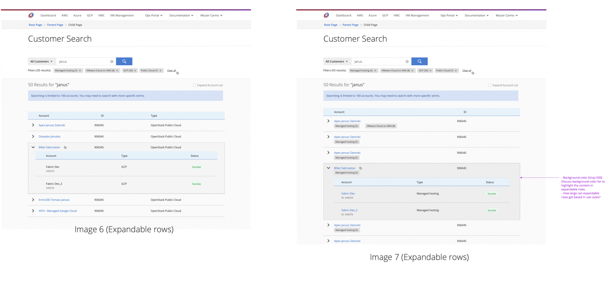
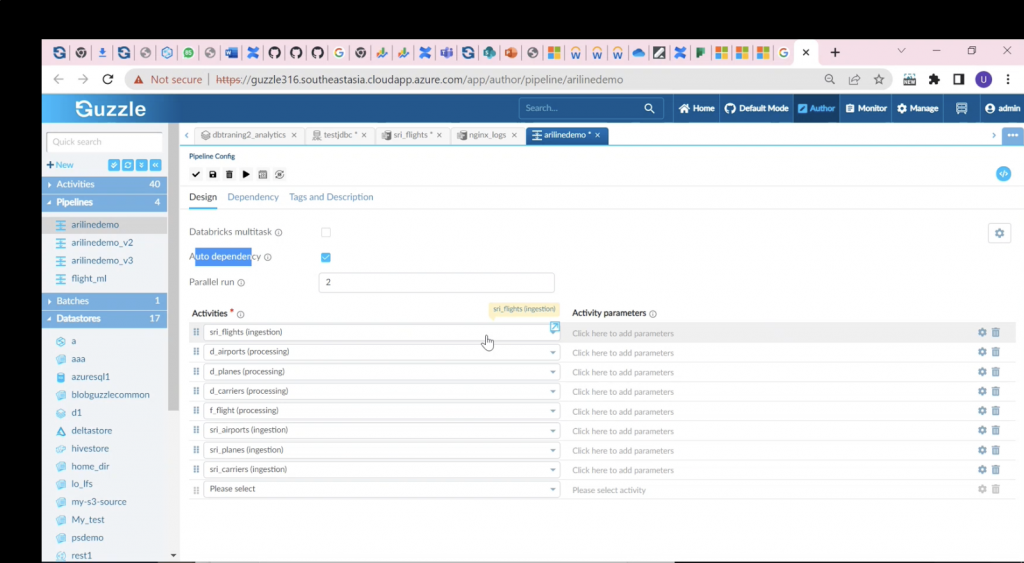
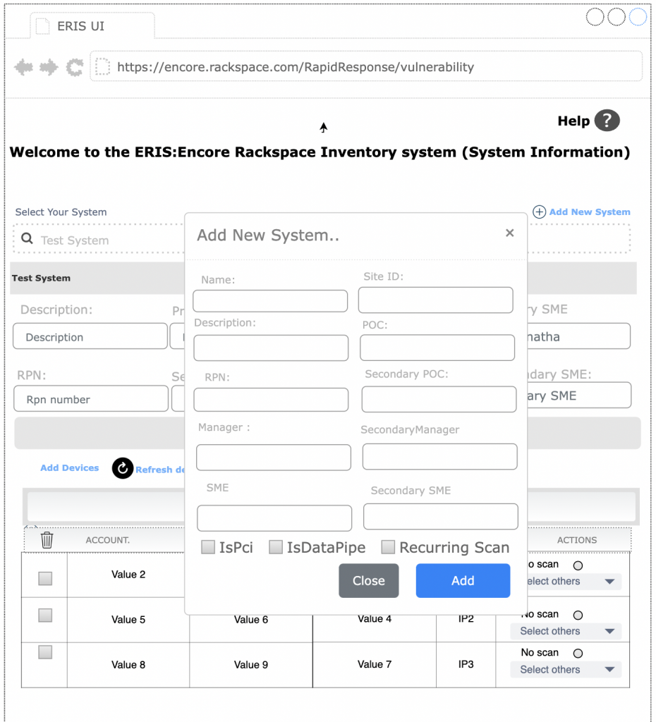
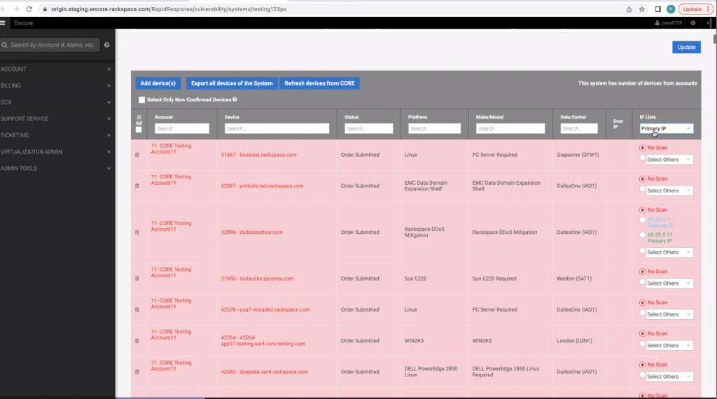
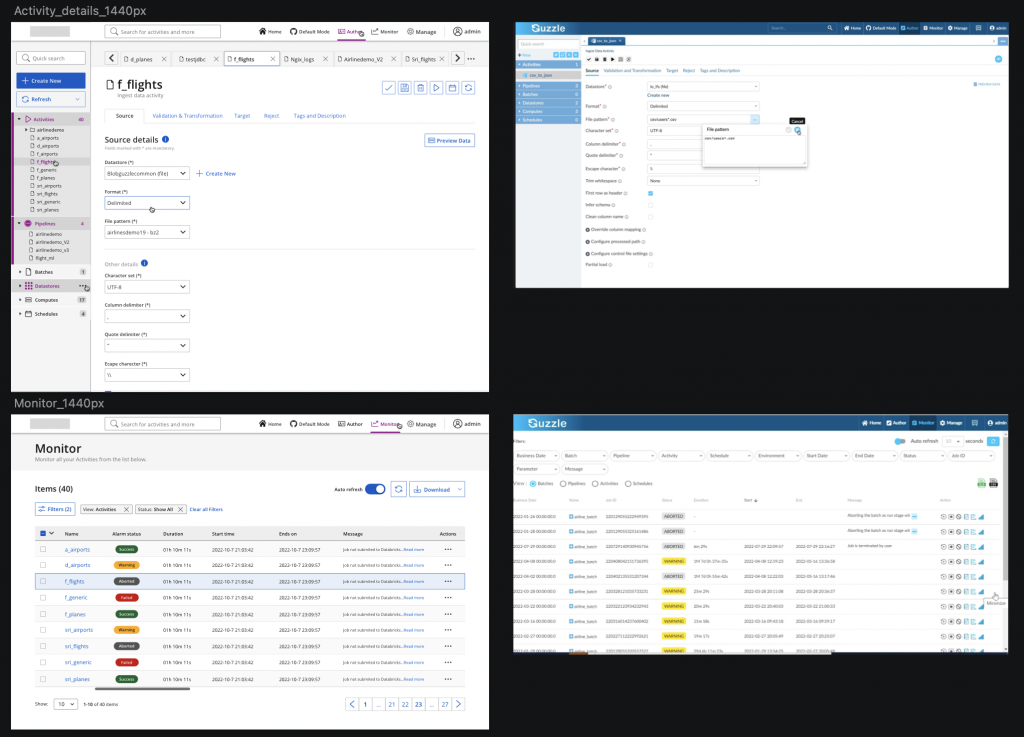
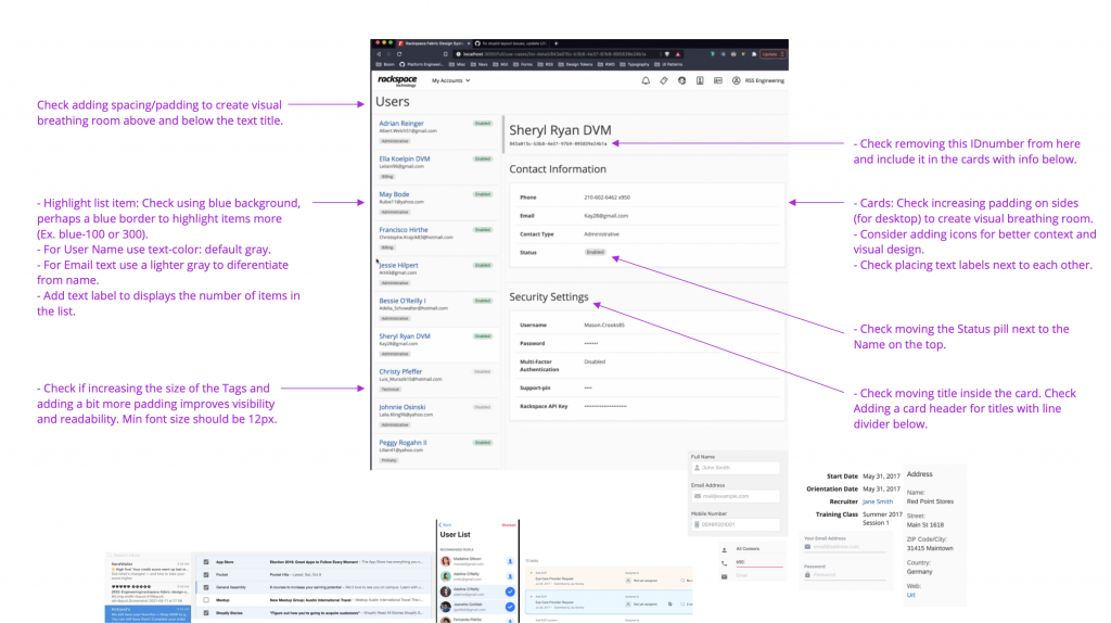
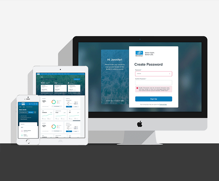
This are some of the examples that the stakeholders presented to me when they explained the current situation of iSafety and what are the challenges and goals. These examples helped to set a start point and a guide for further SDLC steps on the project.
We learned how, where and when the user will use the iSafety, and the main problems iSafety will solve.
- The app currently has a non-secure and basic “Login” system that allows users to access information presented on long lists of text and very limited functionality.
- The data displayed is not categorized and some buttons and links need to be updaded.
- The UI is not responsive for mobile devices and some browsers are not supported.
- The look and feels is outdated and not very intuitive.
The New UI's and design system
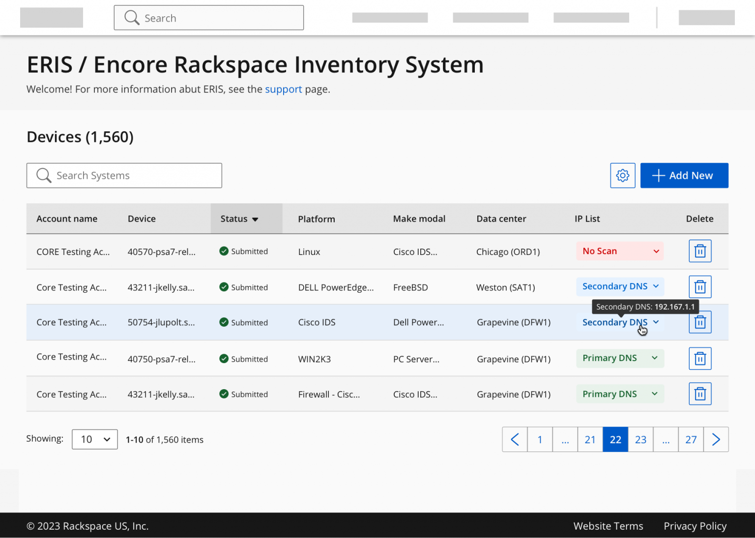
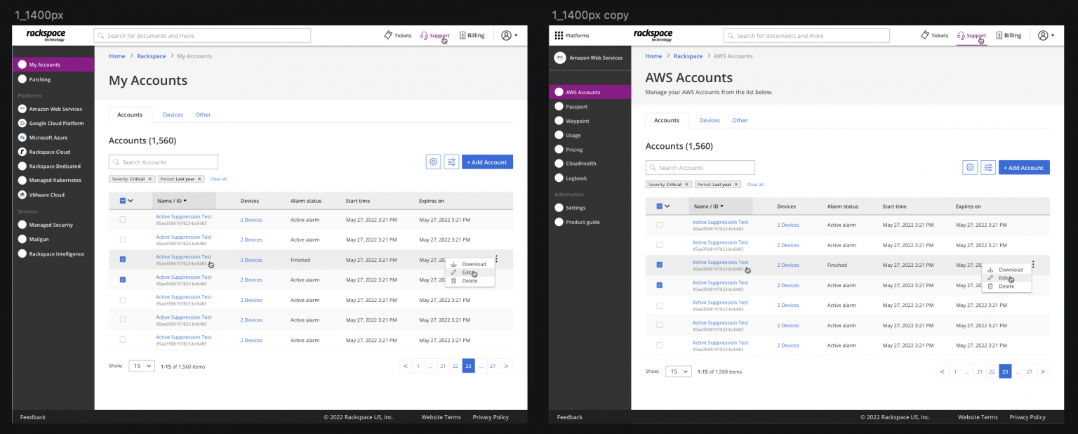
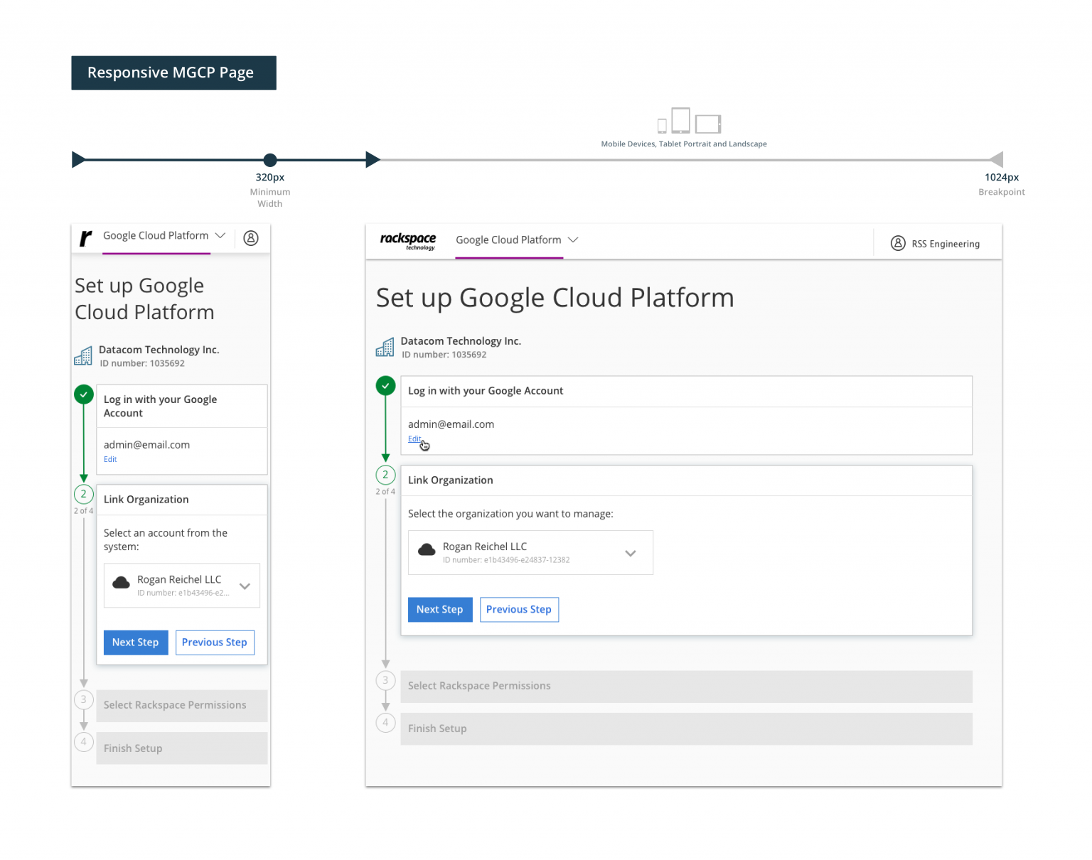
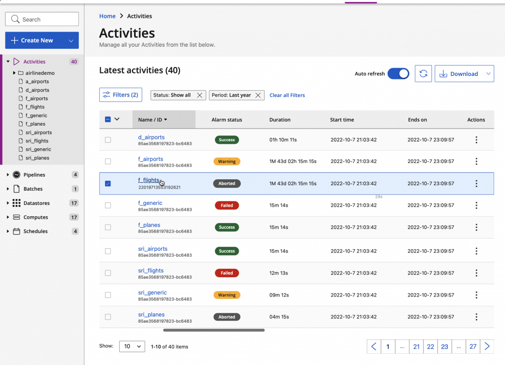
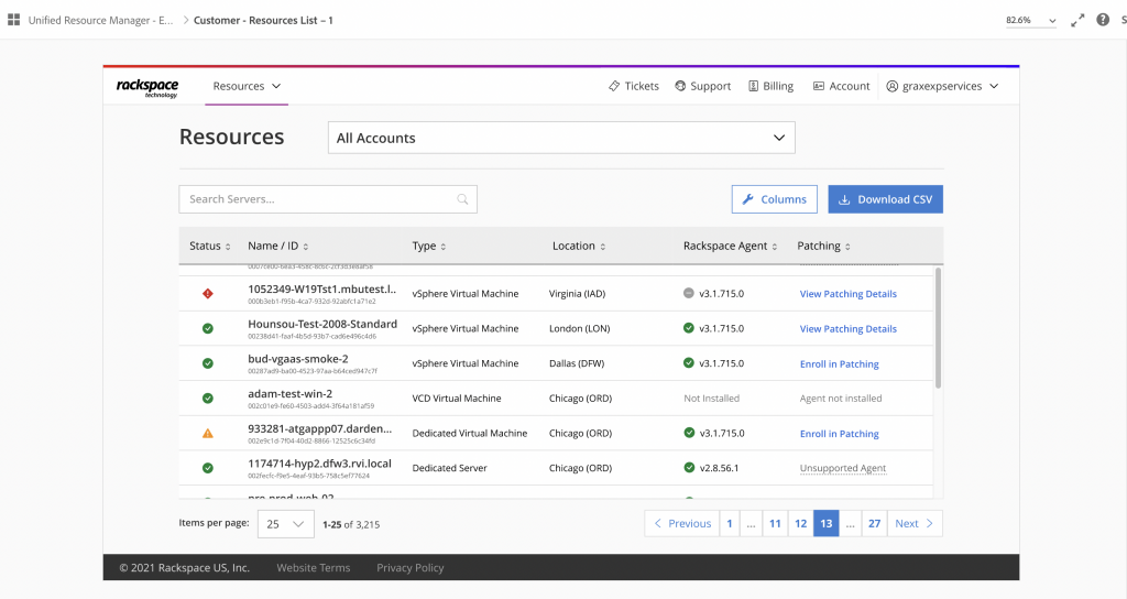
- Overall redesign, site optimization, new look & feel with custom React components and +30 new features that improved by +50% the engagement and overall user experience.
- The new UI’s have easy access to information, It’s more than 50% faster and has +30 new advanced features including:
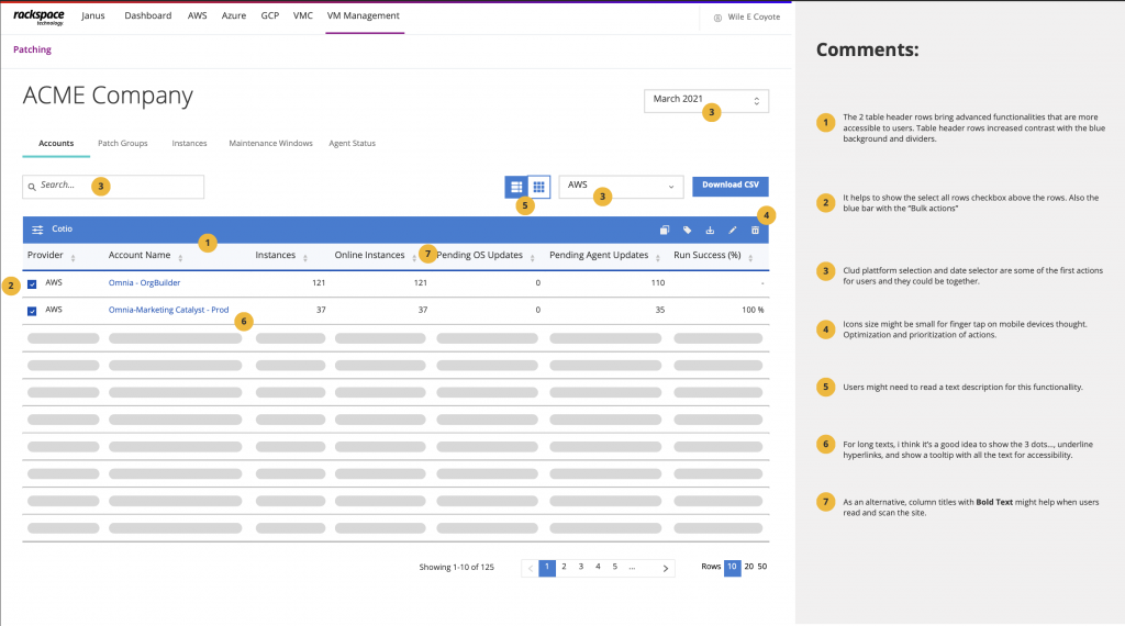
- New dynamic data tables with advanced filtering and search features for better user experience.
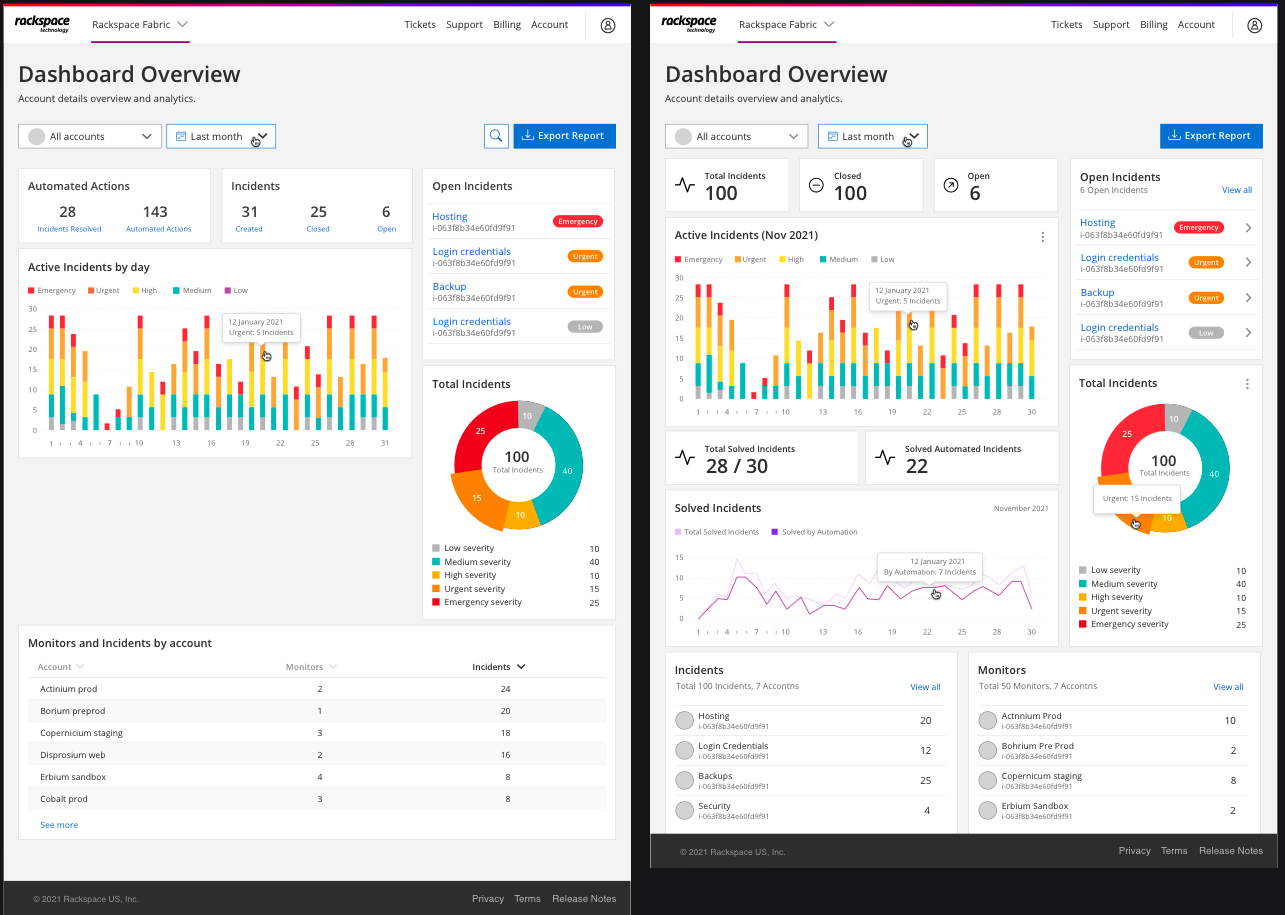
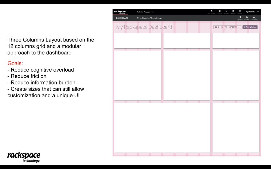
- New user roles, the Admin user can manage data and generate reports with a new custom UI dashboard.
- Responsive for mobile devices and cross-browser compatible.
- Reusable React components library for future steps.
The new UI’s and design system will have more impact on users and generate more revenue for the company.
VI. The Results and Impact
Achivementes:
- The new design system reduced the time and effort needed to complete tasks by offering pre-designed components that increased consistency and templates that can be utilized easily.
- This effort significantly increased user satisfaction and efficiency over 50% in the first 6 months while ensuring a consistent, accessible and high-quality UI and UX across products at the company.
- Also contributing with an increase in positive user feedback, and reducing by more than 50% overall time spent on tasks, and the need for users to contact support due to more efficient workflows and automatization.
- Over 50% increase in adoption rate with the design system usage across various teams and projects.
- Built a library with more than 50 custom icons for the new look and feel of the UI that increased brand awareness, aesthetics, accessibility and the overall user experience.
The new design system reduced the time and effort needed to complete tasks by offering pre-designed components that increased consistency and templates that can be utilized easily:
- +50% User Satisfaction: Positive feedback on the system’s usability and accessibility.
- +50% Operational Efficiency: Streamlined processes, reducing time spent on UI development.
- +40% Adoption Rate: Increased system usage across various teams and projects.
- Reduced Time Spent on Tasks: Faster task completion due to more process automation and efficient workflows.
- Enhanced Product Consistency: Achieved a unified look and feel across all digital products.
V. My Role as Lead UX Designer IV
I had the pleasure to work at Rackspace Technology where I collaborated on multiple projects, and led the FDS Fabric design system initiative, working closely with stakeholders, developers, product managers, and UX/UI designers. My responsibilities included:
- Leadership and Collaboration: Guided a multidisciplinary team to ensure the design system’s alignment with user and business needs.
- Technical Execution: Designed over 100 wireframes, mockups, and prototypes to refine the system’s usability.
- Promoted design best practices: Promoted design insights and adoption of design best practices in the company. I also promoted the usage of AI tools to streamline workflows, improve efficiency, and generate new creative ideas.
- Mentorship: Provided guidance on UX principles and accessibility standards, HTML/CSS markup, and web analytics, enhancing the team’s capabilities.
- Strategic Planning: Defined the roadmap for the design system’s design and development.
- Stakeholder Communication: Regularly presented progress and updates to senior leadership, ensuring alignment with strategic objectives.
Reviews about my work as UX/UI Designer
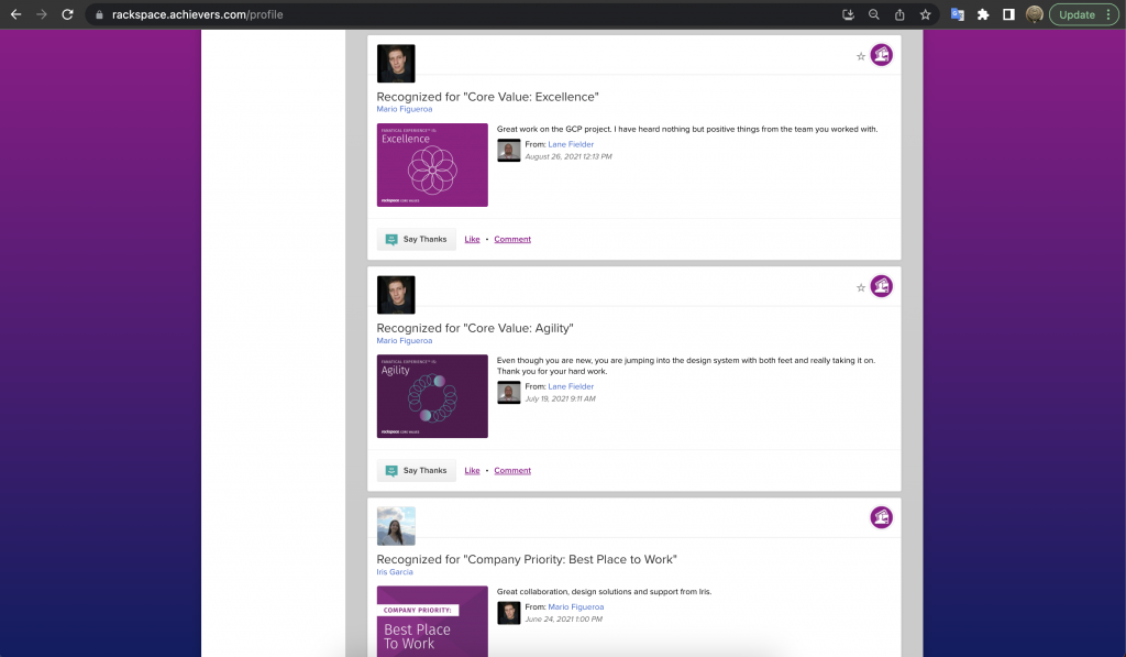
Feedback from Team Members & Colleagues
During our time working together, Mario took ownership over our new design system. He worked with developers and product teams to ensure the design system was satisfying consumers. Our team being completely remote, Mario was very good at reaching out and staying in touch with all parties to ensure progress was made.
I believe any design team would benefit greatly from the skillset that Mario offers.
L. Fielder
UX Manager at Rackspace Technology
I had the opportunity to work closely with Mario, and I can say that he is very talented and passionate. His expertise and knowledge are impressive, and he always stays up-to-date with the latest design trends and best practices. He clearly understands the users’ needs and easily translates them into intuitive design solutions. I would highly recommend Mario and I know that he could be a perfect fit for any company.
I. Garcia
UX Designer III at Rackspace Technology
During our collaboration at Rackspace, what stood out to me was Mario’s blend of positivity, enthusiasm, and a stellar work ethic. As our Lead UX Designer IV, he consistently showcased a commitment to user-centric designs, always anchored in data and user feedback. Beyond his technical acumen, it was his warmth, friendliness, and articulate manner that left an indelible mark. He was always ready to lend a hand, supporting and enlightening others with UX/UI design fundamentals. I wholeheartedly recommend Mario Figueroa. He’s not just a top-tier UX designer but also a wonderful colleague. Anyone would be fortunate to have him on their team.
J. Kinley
Software Developer III at Rackspace Technology
Mario is an extremely talented and passionate designer. He is always willing to provide detailed UI/UX solutions, he is always open to constructive feedback, and he is always open to collaboration. Mario is a class act and high performing individual without an ego. I highly recommend Mario for any design position or company.
S. Salinas
Tech Product Manager at Rackspace Technology
Mario has been able to give our development teams incredibly detailed UX guidance, often citing references and supporting material, and giving a clear rationale behind all his feedback, which has only helped our team create better products and become more accomplished at thinking about User Experience. It’s been a pleasure working with Mario.
N. Arroyo
Software Engineer at Rackspace Technology
In terms of creating amazing UX and building out superb, seamless user interfaces, Mario is one of the best designers I have ever worked with. Not only did. he pay tremendous attention to detail and was highly focused, but he also was a pleasure to work with, and a spectacular communicator. Overall, I highly recommend Mario and hope we can work together again in the future.
P. Doug
Software Developer at Rackspace Technology
The Design Process
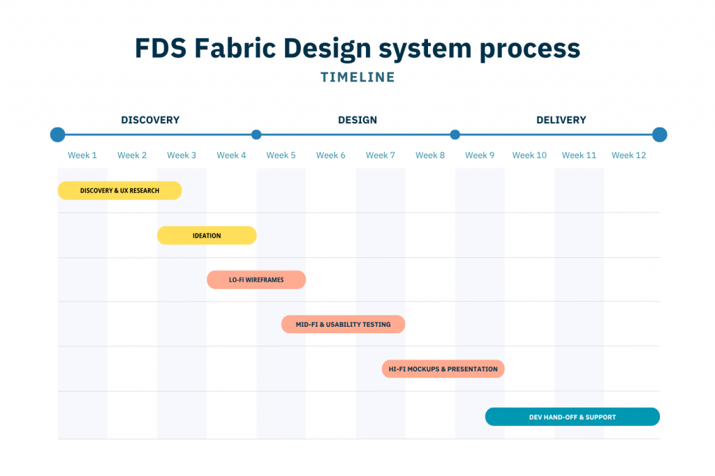
The design process at Rackspace Technology was focused on a user-centered approach, leveraging the Design Thinking methodology to ensure each phase of development was iterative and inclusive.
This process involved deep collaboration across teams, with a strong focus on understanding user needs, ideating creative solutions, continuously testing and refining the design system to meet both user and business objectives.
DiscoverY & UX RESEARCH:
- Conducted stakeholder interviews to gather requirements, understand the pain points and business objectives.
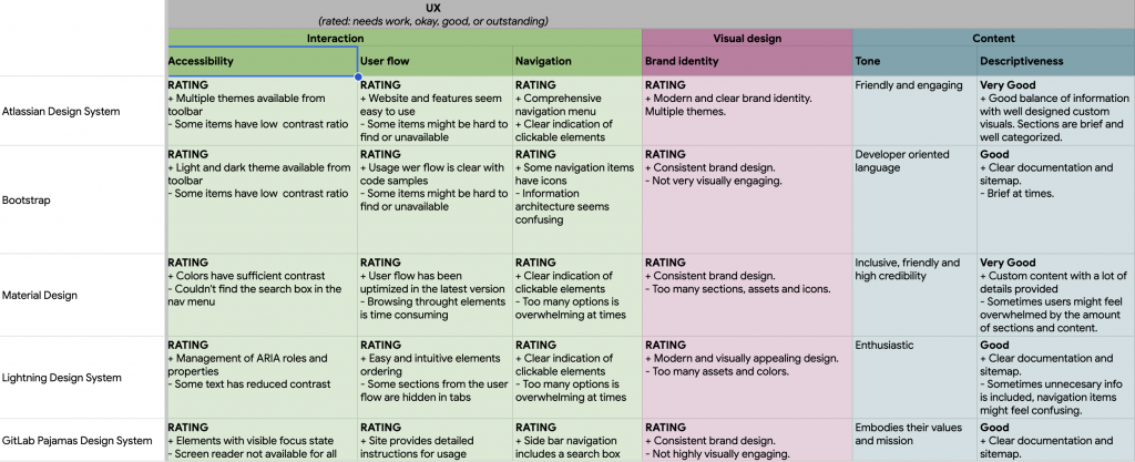
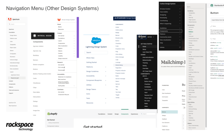
- Analyzed other design systems and components tools to benchmark best practices, compare features, analyze pain points, and opportunities.
- Generated empathy maps and user personas to gain insights into user needs and behaviors.
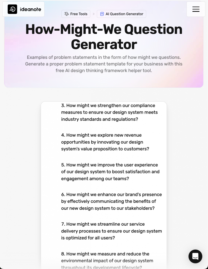
- I used AI tools to streamline workflows, improve efficiency, validate designs and generate innovative solutions.
- Conducted usability and heuristic evaluations to pin point usability issues.
- Facilitated usability testing sessions to gather direct user feedback from end-users and stakeholders.
- Used data from insights and analytics tools to track user interactions and identify trends.
- Documented research findings and prioritized them based on impact and feasibility.
FINDINGS:
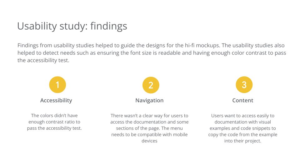
- Users are struggling to interact, build and update UI’s due to the outdated components and incompatibility across systems. Adding new components and updating the guidelines and documentation is recommended.
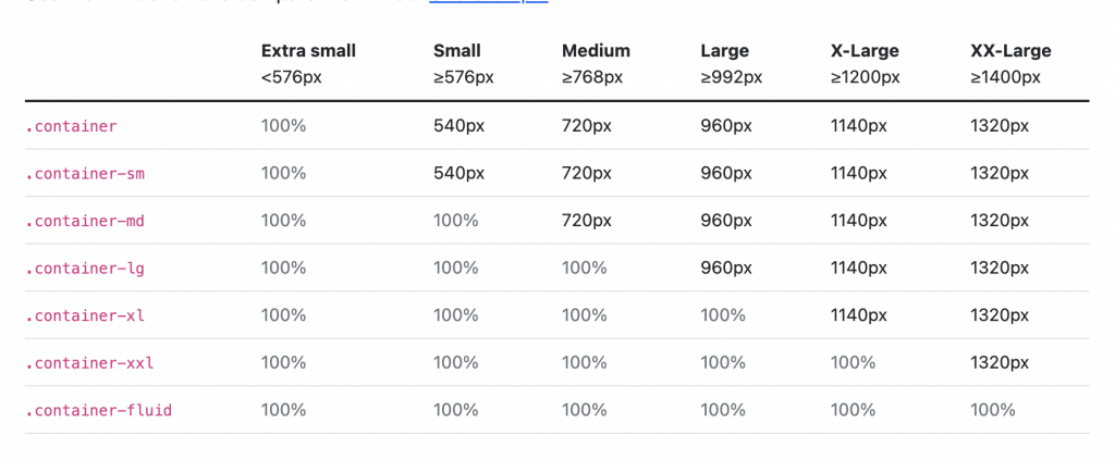
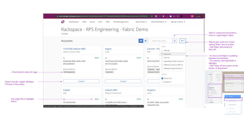
- Developers spend a significant amount of time searching for the correct button style. The design system needs a more organized and searchable component library. Consider adding a simple navigation and a components list with filtering and search capabilities.
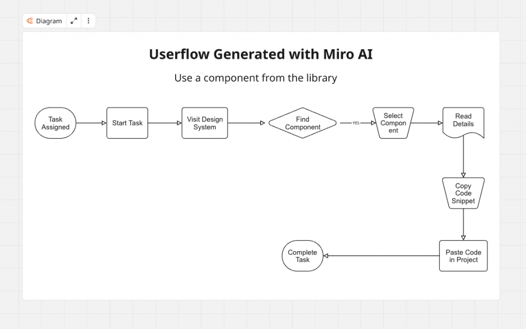
- Provide interactive examples with visuals and code snippets to copy/paste code and optimize the process.
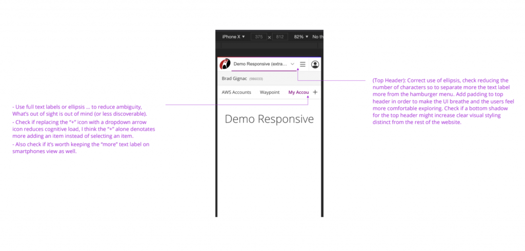
- The navigation menu is confusing and has hidden resources. The nav menu needs to be simplified to avoid nested items and cognitive load.
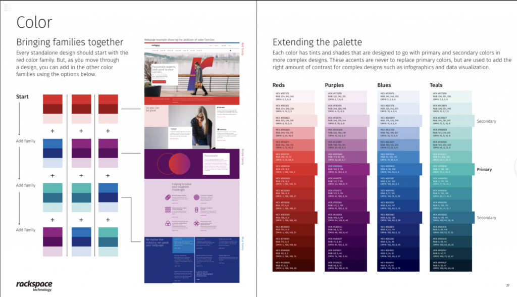
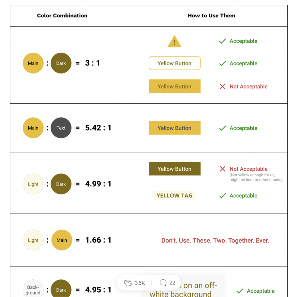
- Designers and developers often struggle to find the correct color palette for their designs. Some of the pages are not WCAG compliant. Consider extending the color palette based on usage (e.g., primary, secondary, accent) and providing clear guidelines for their application.
- Optimize the design system and site for accessibility.
- Use a custom icons library to increase accessibility and brand awareness.
Define:
- In the define phase, I worked with the team on UX research findings and insights to create clear problem statements, user flows and define design principles. This phase was about narrowing down the focus to address the user needs and business goals, ensuring the design efforts were targeted and effective.
- Synthesized research data to define key user problems and challenges.
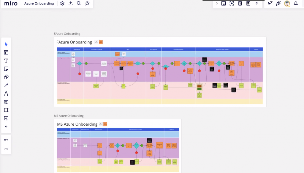
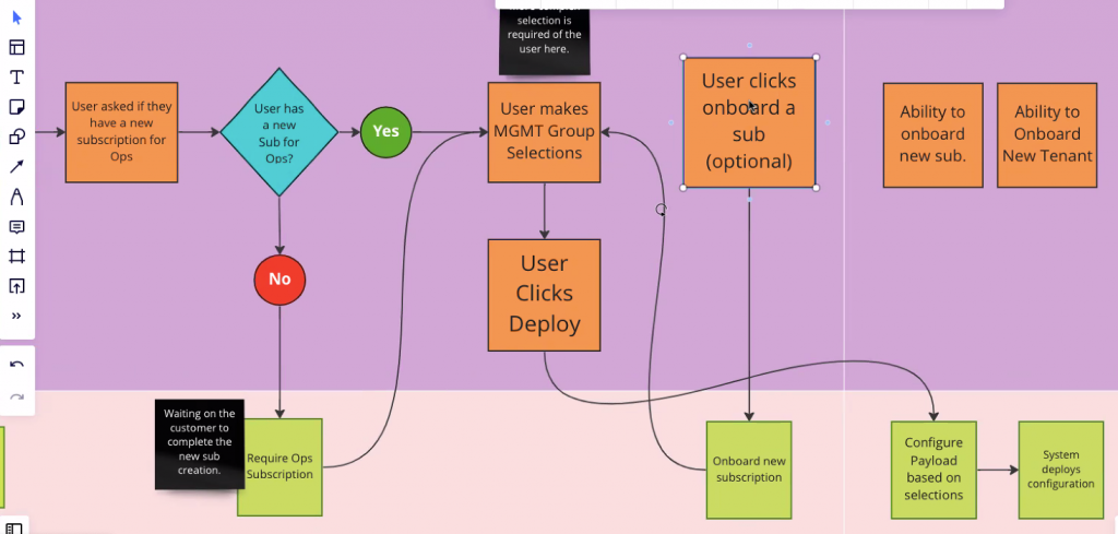
- Generated user flows and journey maps to visualize the user experience across different touch points.
- Established design principles to ensure consistency and user-centered focus.
- Prioritized features and components for the design system based on user needs and business goals.
Ideation:
- The ideation phase was a creative exploration where we brainstormed, developed and iterated multiple design concepts. Through collaboration and rapid prototyping, I generated innovative ideas that were then evaluated for feasibility and alignment with the project objectives.
- Facilitated brainstorming sessions with cross-functional teams to analyze and generate innovative ideas. Conducted design sprints to quickly iterate and refine concepts.
- Encouraged team collaboration to combine diverse perspectives and insights.
Design:
- During the design phase, initial concepts were translated into detailed wireframes and mockups. This iterative process involved constant refinement, with feedback from stakeholders and users guiding the evolution of the design system.
- The new UI’s and dashboard designs were based on data insights from interviews, surveys, sitemaps, user flows, customer journey maps, and usability testing using wireframes, mockups, and clickable prototypes.
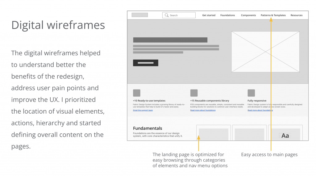
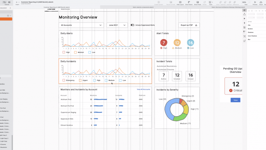
- Brainstormed and sketched low-fidelity wireframes to explore different design directions.
- Developed mid-fidelity prototypes to refine layout and interactions.
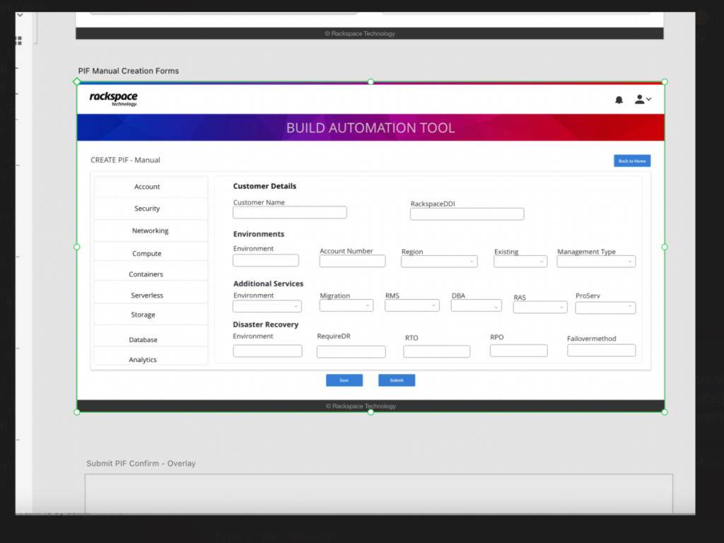
- Designed high-fidelity mockups to present to stakeholders for feedback and approval.
- Built interactive prototypes for user testing and further refinement.
TestING & Findings:
- This phase helped to validate design solutions through usability testing. The feedback gathered from end-users was essential in identifying areas for improvement, ensuring the new design system met user expectations and industry standards.
- I conducted continuous A/B testing to compare different design versions during the process. Results showed that users want a simplified flow, a dedicated website that is accessible, compatible across browsers and devices.
- Iteratively tested prototypes with users to validate design decisions, gather feedback on usability, accessibility, and measure user satisfaction.
- The users have problems contacting support. Provide clear documentation with instructions and automate processes with a chatbot answering FAQ’s will help to automate and reduce frustration.
- Analyzed test results to identify areas for improvement and implemented changes based on insights from usability testing.


Hi-Fi Mockups & Prototypes
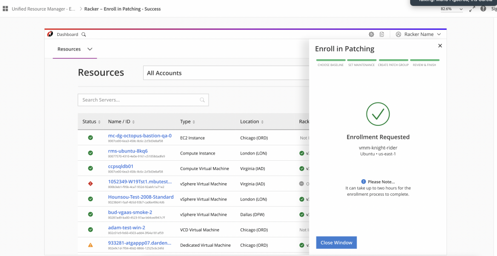
The high-fidelity mockups and prototypes translated the design concepts into detailed, visually polished representations. This stage was essential for visualizing the final product and provided a platform for usability testing and stakeholder feedback before development.
- Visual Consistency: Ensured the high-fidelity mockups adhered to the established design system and brand guidelines, maintaining a cohesive visual language across all components.
- Interactive Prototypes: Created clickable prototypes to simulate real-world user interactions, allowing for thorough usability testing and validation of design solutions.
- Iterative Refinement: Conducted multiple design reviews, incorporating feedback from stakeholders and users to refine the prototypes and ensure they met user expectations.
- Stakeholder Engagement: Presented the prototypes to stakeholders for feedback, ensuring alignment with business to guide the design direction.
- Development Handoff: Delivered detailed design specifications alongside the final prototypes, facilitating a smooth transition to the development team and ensuring design fidelity during implementation.


The Outcomes and Impact
The impact & Results
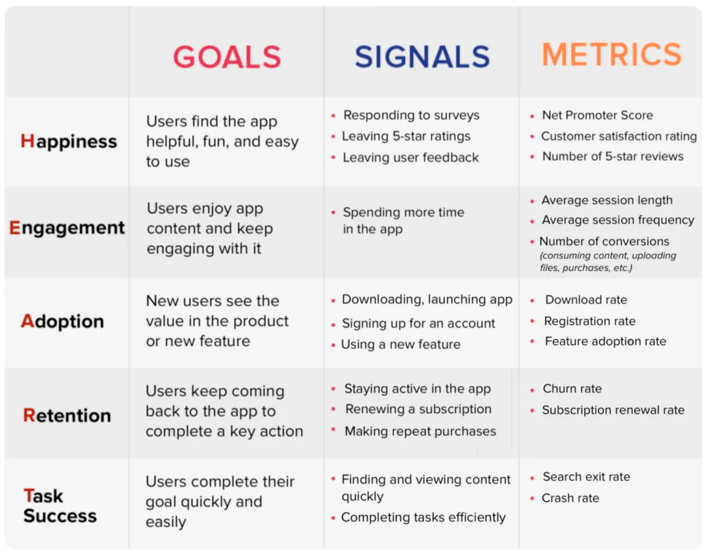
The outcomes of this project were substantial, with measurable improvements in user experience, engagement, and overall satisfaction. The new design system reduced the time and effort needed to complete tasks by offering pre-designed components and templates that are accessible and can be utilized easily:
- +50% User Satisfaction: User feedback indicated a significant rise in satisfaction, driven by the improved consistency and usability of the design system.
- +50% Efficiency: The streamlined processes and comprehensive components library reduced time spent on UI design and development, increasing overall productivity.
- +30% Adoption Rate: The design system was quickly embraced by various teams, demonstrating its practical value and ease of integration into existing workflows.
- Enhanced Accessibility: Compliance with WCAG standards improved accessibility, making the system more inclusive and usable for a broader audience.
- Consistent Product Experience: Achieved a unified and professional look across all digital products, enhancing the brand’s image and user trust.


Lessons Learned
- Continuous User Engagement: Regular feedback loops from usability testing ensured that design solutions remained aligned with user needs, leading to more effective outcomes.
- Importance of Accessibility: Early integration of accessibility standards, like WCAG compliance, greatly improved the inclusivity and usability of the design system.
- Collaborative Problem-Solving: Cross-functional collaboration fostered diverse insights, enhancing creativity, problem-solving and the overall design quality.
- Empathy for Users: Developing empathy through user research helped in creating more relevant and impactful design solutions.
- Data-Driven Decisions: Utilizing analytics and user feedback provided actionable insights, guiding the design process and validating design decisions.
The Next Steps for the Design System
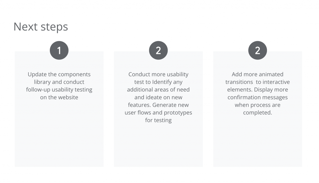
- Component and Documentation Review: Regularly update the components library and documentation to address bugs and introduce new features.
- Expanded Usability Testing: Conduct further usability tests to explore additional areas for improvement and new use cases.
- Enhanced Interactions: Introduce more interactive elements and feedback mechanisms to improve user engagement and accessibility.
- Documentation and Icons Library: Continue to expand the documentation and custom icons library to support the growing needs of users.
- Accessibility Enhancements: Further evaluate and improve the system’s accessibility features, ensuring it meets evolving standards and user expectations.

