Case Study: iSafe Web App at Essilor Luxottica
Designing a Web-based Self Service Portal for Eye-care Practitioners and Building a Design System
As Lead UX Designer at Essilor Luxottica working on building a design system for improving three web apps, and iSafe, the secure web-based portal that helps eye-care practitioners (ECP) and companies to access data and manage their eye wear program. This initiative allowed to increase quality, accessibility, consistency and compatibility across digital products from the company. Also optimize the design/development process, accessibility, adoption and efficiency by +50%.
Role: Lead UX Designer & Web Dev Support
Client: Essilor of America
Timeline: From 2016 – 2018
Location: On Site (Dallas, TX)


📈 The Impact
Project Overview
iSafe helps eye-care practitioners (ECP) and companies to access data and manage their eye wear program through a secure Web-based app.
The client is Essilor of América, the company manufactures and supplies optical products globally. They offer a wide range of eyeglass and lenses. The R&D team was assigned to work on the redesign and update of 4 internal and external outdated web apps including the iSafety app.
Objective: Redesign outdated web applications, create a scalable design system, elevate user experience and engagement.
Key Highlights: Built a comprehensive design system with over 30 Angular Material components. Enhance cross-browser and mobile compatibility. Increased efficiency, accessibility and adoption of tools by 30%.
👥 End-users and Audience
The web app is aimed at eye-care practitioners and members from the portal, also project managers, engineers and other designers who work at the company.


My Role as Lead UX Designer
As the Lead UX Designer, I collaborated across projects with other specialized team members to create and engaging user experiences, generate extensive documentation, provide guidelines and best practices to improve the user experience and user interface design.
One key strategy was the collaboration with developers and other designers on the new components library, design system and the custom website where users can access easily to the components library and documentation from a browser on desktop and mobile devices.
Some of the first duties and milestones:
- UX Research and Analysis, collect data from the business and a variety of sources. Analyze requirements and business goals, estimate efforts to align roadmap.
- The current site didn’t have a clear navigation. The initial version was not fully compatible, the functionality was limited and overall usage is confusing.
- Define scenarios, user flows and screens needed for the UI. The brand needs a logo and defined guidelines.
- New custom UI based on more than 30 customized Angular Material and Bootstrap components. I helped to style and develop 8 new custom components for specific user tasks.
Reviews about my work as UX/UI Designer
Feedback from Team Members & Colleagues
Mario is a very talented UI/UX designer who cares deeply about his team and the people he works with. He always went the extra mile to ensure he understood the business requirements and gave excellent feedback. Mario took time to learn all the development intricacies involved. I would highly recommend Mario to any of my friends and colleagues and any company would be lucky to have him.
K. Thomas
Tech Manager at Essilor of America
I had the opportunity to work along with Mario at Essilor and honestly I think he was a perfect fit for the project needs. He was able to delivery a high quality work with no delays. His expertise and his background as UX Professional make him one of the best UX Designers. As person I think he is a very kindly guy definitely he could be a perfect fit for any company.
A. Rodríguez
Software Engineer at Essilor of America
Mario has driven several high-impact (global) content projects. He can take complex business requirements and translate them into technical requirements in an engaging way, designed to give his business partners the most flexibility. Mario’s approach is innovative as he leverages his abilities, and the skills of his colleagues, to inform his designs and overall process thinking within the context in which the features/functions will be used. I would highly recommend him to any position as he adapts to any environment quickly.
E. Jones
Project Manager at Essilor of America
During our time working together, Mario took ownership over our new design system. He worked with developers and product teams to ensure the design system was satisfying consumers. Our team being completely remote, Mario was very good at reaching out and staying in touch with all parties to ensure progress was made.
I believe any design team would benefit greatly from the skillset that Mario offers.
L. Fielder
UX Manager at Rackspace Technology
I had the opportunity to work closely with Mario, and I can say that he is very talented and passionate. His expertise and knowledge are impressive, and he always stays up-to-date with the latest design trends and best practices. He clearly understands the users’ needs and easily translates them into intuitive design solutions. I would highly recommend Mario and I know that he could be a perfect fit for any company.
I. Garcia
UX Designer III at Rackspace Technology
Mario has been able to give our development teams incredibly detailed UX guidance, often citing references and supporting material, and giving a clear rationale behind all his feedback, which has only helped our team create better products and become more accomplished at thinking about User Experience. It’s been a pleasure working with Mario.
N. Arroyo
Software Engineer at Rackspace Technology

The Problem Statement
Design and Development teams at Essilor struggle to complete tasks. Currently it takes too much time and effort because there are inconsistent components and outdated systems, making it difficult to efficiently create from scratch and update interfaces that are accessible and compatible.
The Challenges
While the current version has been running for almost 10 years, our challenge as the R&D team was to explore different ways to add more than 30 new features and complete overall redesign, site optimization, new look & feel with new custom Angular components and +30 new features that improved by +50% the engagement and overall user experience.
- Redesigning a decade-old system with limited usability.
- Integrating +30 new features and custom Angular components.
- Ensuring cross-platform compatibility and WCAG compliance.
- Building a scalable, user-friendly design system accessible to developers and designers.
- Aligning multiple stakeholders’ goals within tight timelines.

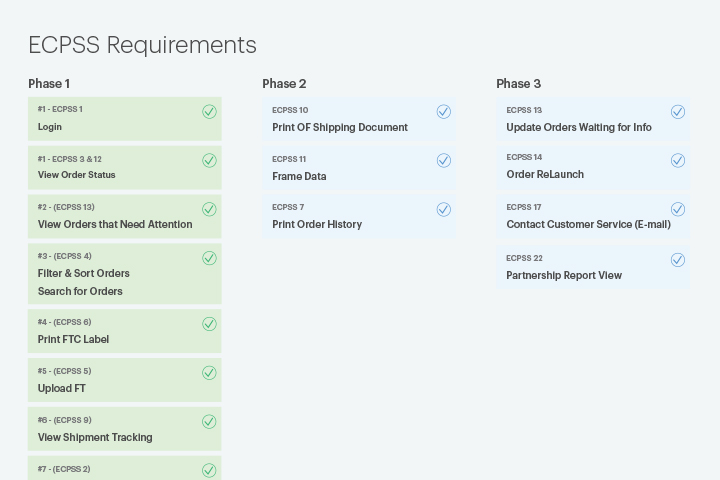

The Solution: Goals and Objectives
- Complete re-design: Improve overall UI/UX design and increase engagement.
- Designed a modular design system for future scalability and quick updates.
- Conducted detailed UX research, including interviews and competitive analysis.
- Created WCAG-compliant designs with improved color contrast and typography.
- Enhanced navigation with responsive menus and simplified flows.
- Built prototypes and validated them through rigorous user testing.
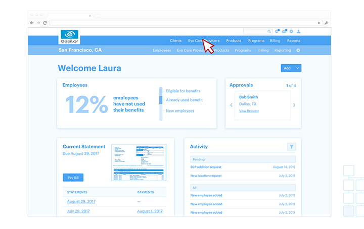
- Each type of user has different features. The Admin user can manage data and print reports with a new custom UI dashboard. Users can print generated dynamic order forms.
The Old Version
This are some of the examples that the stakeholders presented to me when they explained the current situation of iSafety and what are the challenges and goals. These examples helped to set a start point and a guide for further SDLC steps on the project.
We learned how, where and when the user will use the iSafety, and the main problems iSafety will solve.
- The app currently has a non-secure and basic “Login” system that allows users to access information presented on long lists of text and very limited functionality.
- The data displayed is not categorized and some buttons and links need to be updaded.
- The UI is not responsive for mobile devices and some browsers are not supported.
- The look and feels is outdated and not very intuitive.


The New Web App
Overall redesign, site optimization, new look & feel with +30 custom Angular components and +30 new features that improved by +50% the engagement overall user experience.
The brand new Web Progressive App has easy access to information, It’s more than 50% faster and has +30 new advanced features including:
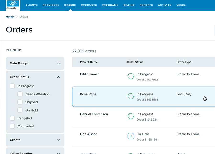
- New dynamic data tables with advanced filtering and search features for better user experience.
- New user roles, the Admin user can manage data and generate reports with a new custom UI dashboard.
- Responsive for mobile devices and cross-browser compatible.
- Reusable Angular Material Design components library for future steps.
iSafety will have more impact on users and generate more revenue for the company.


Results and Impact
Achievements:
- +50% increase in engagement and user satisfaction.
- Reduced task completion times by 30%.
- Improved accessibility and cross-browser compatibility.
- Enhanced team productivity by introducing reusable design assets.
- Delivered a progressive web app with advanced features like dynamic data tables and dashboards.


The Design Process
I began working on UX research to gather data from multiple sources in order to build User Empathy. I collected data from stakeholders and other sources related to the end-users. I Used the Design Thinking approach for solving problems and we followed the this process.
The UI design for the web app is desktop-frst and follows a graceful degradation strategy. It’s focused to be user-friendly by providing a clear navigation and helpful information on how to use the elements from the UI and features while keeping in mind accessibility and inclusive design.


Phase 1: Discover & UX Research
As the UX lead designer, I provided effort & time estimation, how and what I’m going to be working on for the next weeks, the tools I’ll use and the first rough concepts on pen & paper, I also wrote a list of questions regarding the workflow.
- Conducted interviews and surveys with stakeholders and end-users to uncover pain points.
- Analyzed competitor systems to identify gaps and opportunities for innovation.
- Developed empathy maps and user journeys to align the design process with user needs.
- Validated research findings with usability tests to prioritize features effectively.

Phase 2: Define
- Created detailed user personas to represent target audiences and their behaviors.
- Mapped user journeys to identify challenges and opportunities for streamlined workflows.
- Developed clear, actionable problem statements based on research insights.


Phase 3: Ideation
An early ideation phase helped me to explore more solutions, design concepts and overall ideas to solve problems. I used insights from my research to create the first versions of the sitemap. This helped to oversee the screens needed and visualize the hierarchy.
- Brainstormed solutions with cross-functional teams using workshops and wireframes.
- Created a sitemap with a simplified navigation structure for improved usability.
- Explored multiple design concepts to address diverse user needs.


Phase 4: Design
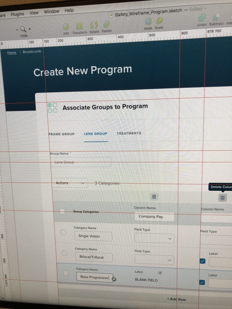
To gather insights and validate design concepts, I started defining rough sketches on pen and paper, white board sessions as teamwork and worked on various levels of fidelity from lo-fi wireframes to hi-fi mockups on Axure, Balsamiq and Sketch.
- Produced low, mid, and high-fidelity wireframes to iterate on design ideas.
- Designed a cohesive visual language with WCAG-compliant color contrasts and typography.
- Built interactive prototypes for validation with stakeholders and users.


Usability Testing
During the process I constantly conducted usability tests to understand better the users and make design decisions to develop and refine my designs through user feedback.
- Conducted usability tests and A/B testing to refine designs and improve navigation.
- Validated accessibility with tools and standards to ensure inclusivity for all users.
- Iterated designs based on user feedback to enhance the overall experience.
- Usability testing allowed me to identify problems, improve the quality of designs and UX.
- Validate assumptions and detect issues with the navigation and hierarchy of sections of the site and elements from the UI.
- Learn users behavior, collect data to take decisions.
- The continuous tests conducted helped to ensure that site is WCAG 2.1 compliant and accessible to more users. I selected colors in a meaningful and accessible way to generate this harmonious color and improve the user experience.


Hi-Fi Mockups & Prototypes
- Delivered polished, high-fidelity mockups showcasing improved navigation and features.
- The hi-fi mockups and prototypes followed the same user flow as the lo-fi versions, and also included design updates that are based on suggestions from users such as adding more information, new components and accessible links to other pages.
- Created clickable prototypes to demonstrate dynamic functionality and validate concepts.
- Integrated responsive designs compatible with both desktop and mobile platforms
Developing the designs
After I finalized the mockups, I collaborated with front-end developers from my team. During this phase they took charge of building the environment and I helped to optimize the lines of code and name attributes for the SCSS files, all based on the guidelines that I had previously generated for the documentation as reference. I constantly checked the files and specific lines of code for optimization and maintenance.




✨ The Outcomes and Impact
The impact: Improved Look & Feel with Intuitive Navigation
- Increased user engagement by 50% and reduced task completion times by 30%.
- Enhanced accessibility compliance, ensuring the platform met WCAG 2.1 standards.
- Empowered internal teams with a scalable design system and reusable components.
- This project added more design and technology culture to the company. The team gained confidence from the Client, they brought more projects and budget to the R&D Team.
- Delivered a responsive web app with +30 advanced features, improving efficiency and satisfaction.


Lessons Learned
- This project was a great learning experience for me in so many ways. I feel like in overall our team accomplished an incredible amount of work considering the challenges, and a short timeline. I personally learned a lot about the process, gained new skills, collaboration with specialized teams working on new web technologies and gained new friends. I also learned more about myself.
- The importance of empathy and collaboration in cross-functional teams.
- The value of thorough UX research to drive user-centered design.
- The importance of research and user centered design: This project allowed me to do a lot more research thanks to good team strategies. I saw this as an opportunity to strengthen my UX research skills and get more involved in the process of learning about the users and their needs in order to have a better perspective and ideas in mind to empathize and define-solve user problems.
- Leveraging design systems to streamline workflows and scale projects effectively.


The Next Steps
- Expand the design system with additional components and interactive examples.
- Conduct further usability testing to uncover additional improvements.
- Introduce micro-animations and refined transitions to enhance interactivity.
- Design and add the new icons to the custom icons library.
- Update the documentation with advanced tutorials and code snippets for developers.


